SeedCater
SeedCater 籽樂加 is a plant-based supplement brand for Hong Kong. We built its brand strategy and identity, from positioning to the logo.

The challenge
Hong Kong’s supplement shelf is crowded. Look at the packs on a Watsons shelf: cluttered information, visual noise, weak brand stories and little to tell one brand from the next.

The idea
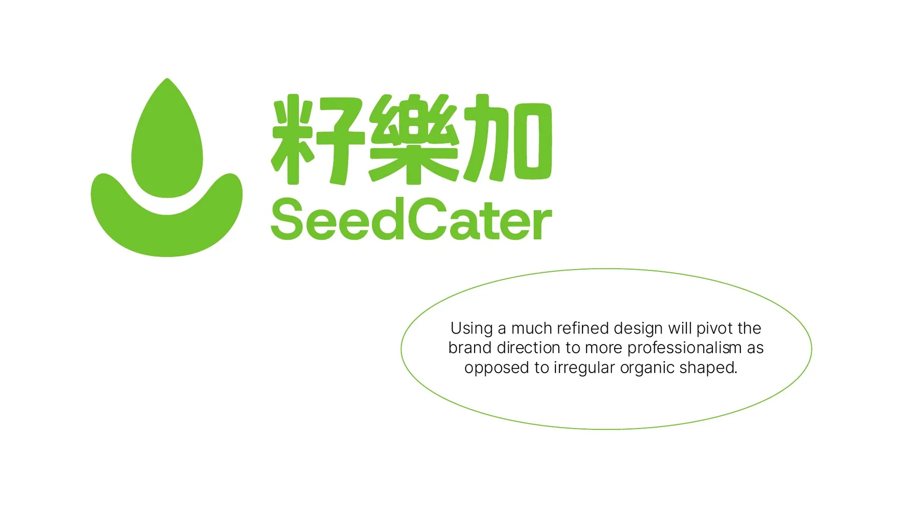
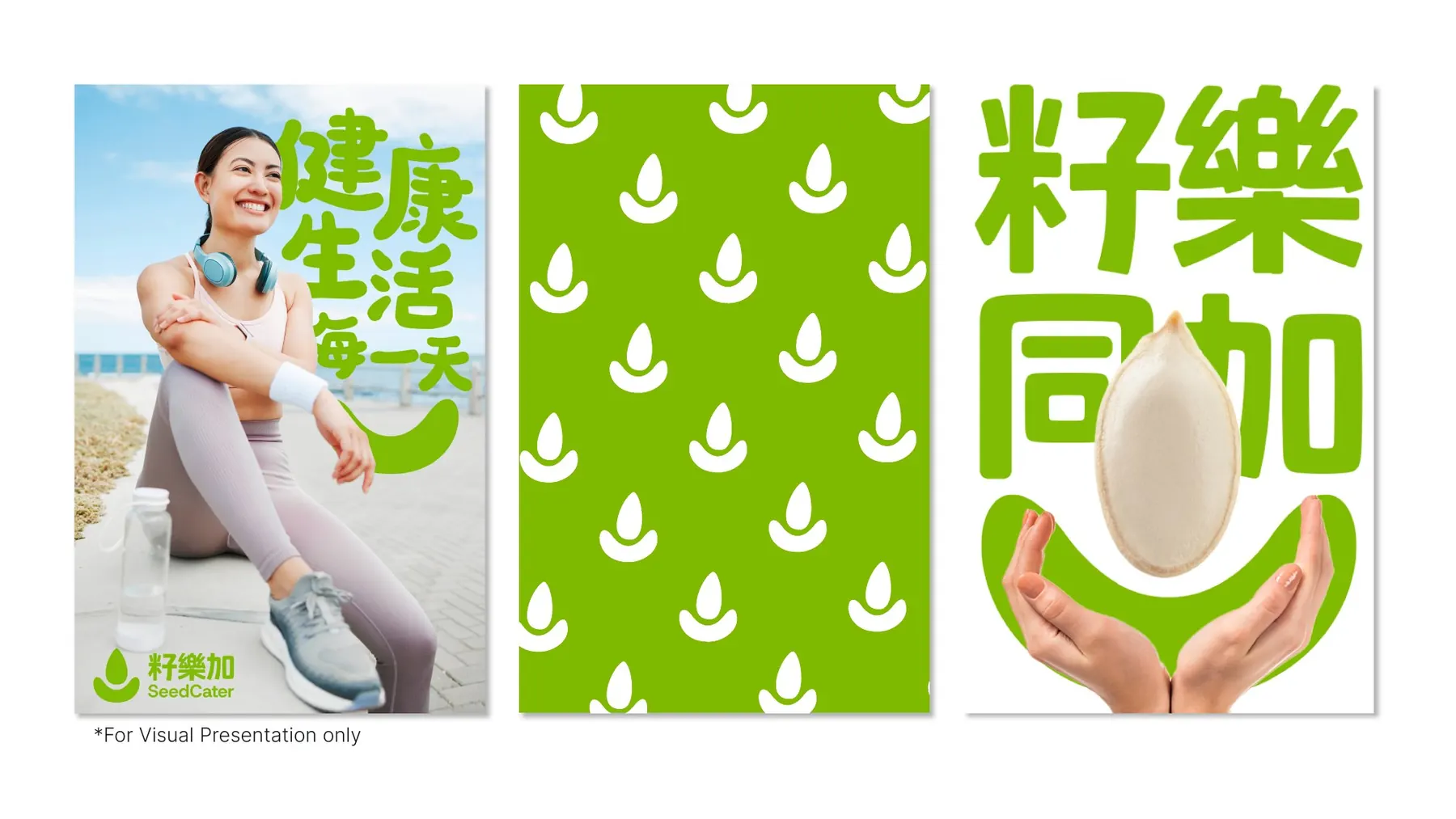
Start from the seed: small, but it grows. The mark is a seed held in two hands, for ingredients picked straight from the earth, in one fresh green, Pantone 376C. Natural and modern, calm enough to stand out on a loud shelf.
What we made
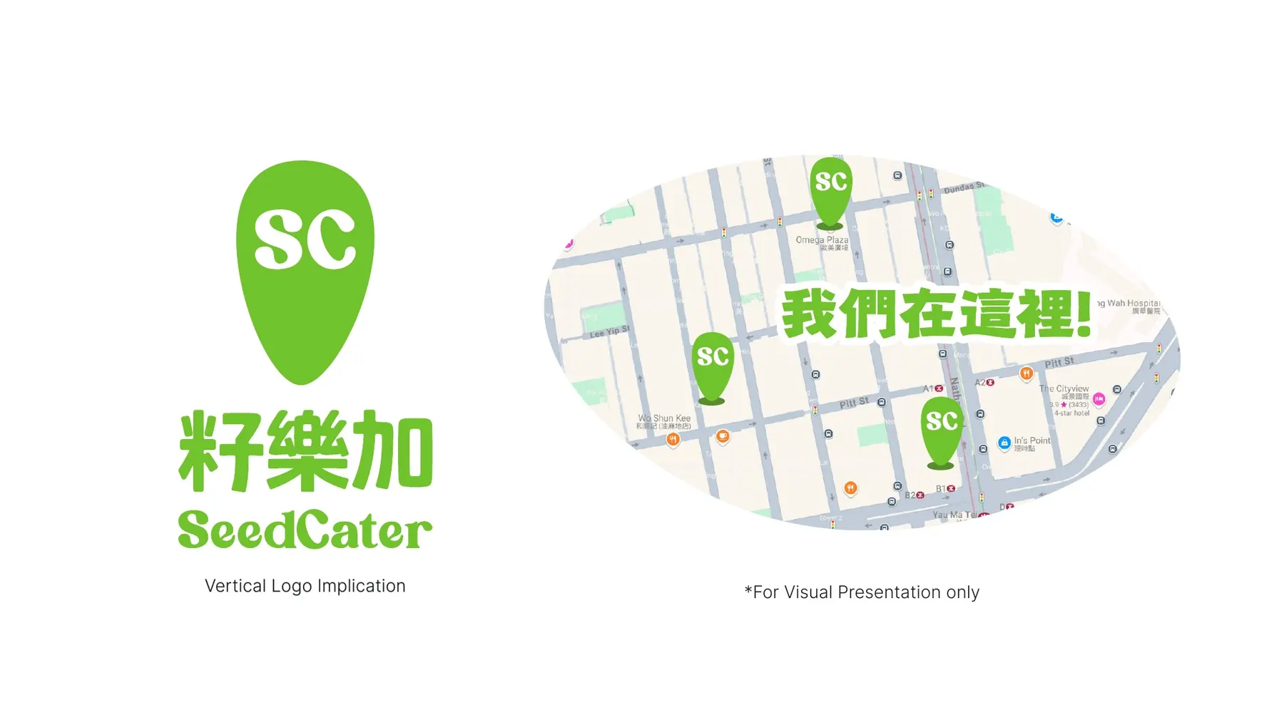
Positioning in the Hong Kong market, the target audience, a moodboard, two logo directions (one hand-drawn and organic, one refined), the colour system, and the brand applied to posters and lifestyle visuals.

The result
A distinct position, natural and modern, built to cut through a saturated market. The refined logo direction moves the brand toward a more professional feel.